Welcome to Bytes Vibe’s Blogger tutorials series. In this post, I will guide everyone on How to Add a Responsive Hero Section in Blogger Website. Bytes Vibe working on giving you best blogger experience with our blogger related posts. Hero section for Blogger website is must for a professional blogger website. We will Create hero section on Blogger with just simple 2 steps.
What is a hero section in a webpage?
A hero section is the first thing visitors see when they land on our blogger or any types of website. It’s a large, visually appealing area that includes a background image or video, a headline, and a call-to-action (CTA).
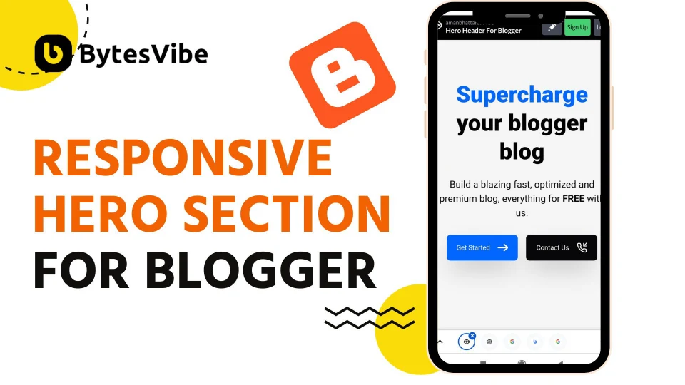
The header hero section sets the tone for entire site. It’s a opportunity to grab the visitor’s attention. With blogger hero section we can guide them to take action like to signing up for a newsletter, exploring content, or making a purchase. I saw this beautiful blogger hero section from twistblogg and thought I should share this.
Step-by-Step Guide: Add a Responsive Hero Section in Blogger
One of the most straightforward ways to add a hero section to Blogger website is by using custom HTML and CSS. This method gives full control over the design and responsiveness of blogger hero section. Follow these steps below to add a responsive hero section in blogger:
- Step 1: Add CSS for blogger hero section
1. We need to add some css for our Custom hero section for Blogger. To add css – Log in to Blogger website and Go to theme section. Click on drop-down button and select “Edit Html”
2. Search for </head> or </head> and add following CSS code above it.
<style>
/* Responsive Big Hero Header By TwistBlogg.com */
/* Re shared by Bytesvibe.com*/
.hero-header {
  margin: 50px auto 200px auto;
	padding: 50px 20px;
	max-width: 1200px;
	font-family: 'Inter,sans-serif';
	background: #f5f5f5;
}

.hero-header .main-text {
	font-size: 96px;
	line-height: 1.25;
	font-weight: 800;
	color: #000;
}

.spancolor {
	color: #0066ff
}

.text {
	margin-top: 1.5rem;
	font-size: 24px;
	line-height: 1.5
}

.two_buttons {
	grid-auto-flow: dense;
	display: grid;
	grid-template-columns: repeat(2, minmax(0, 1fr));
	grid-gap: 1rem;
	margin-top: 0.90rem;
	width: 48%
}

.default_button {
	display: inline-flex;
	-ms-flex-align: center;
	align-items: center;
	-webkit-box-pack: center;
	-webkit-justify-content: center;
	-ms-flex-pack: center;
	justify-content: center;
	font-size: 20px;
	text-decoration: none;
	border: 1px solid #DADADA;
	border-radius: 0.5rem;
	padding: 1rem 0.75rem;
	cursor: pointer;
	transition: all .15s ease-in;
	background-color: #0066ff;
	color: white;
	box-shadow: 0 25px 50px -12px rgba(0, 0, 0, 0.25);
}

.default_button svg {
	width: 22px;
	height: 22px;
}

@media screen and (max-width: 1024px) {
	.hero-header .main-text {
		font-size: 80px !important;
	}
}

@media screen and (max-width: 832px) {
	.hero-header .main-text {
		font-size: 64px !important;
	}

	.two_buttons {
		width: 55%
	}

	.default_button {
		font-size: 16px !important;
	}
}

@media screen and (max-width: 640px) {
	.hero-header .main-text {
		font-size: 48px !important;
		text-align: center;
		margin-top: -15px !important;
	}

	.text {
		font-size: 20px !important;
		text-align: center;
	}

	.two_buttons {
		width: 90%;
		margin: 30px auto;
	}

	.default_button {
		font-size: 14px !important
	}
}
</style>Code language: HTML, XML (xml)
Now that we have successfully added css for blogger hero section, Let’s go to step 2.
- Step 2: Add Html for Hero Section in Blogger
Now we need to add add html for this hero section on blogger homepage. To add this responsive hero section in blogger homepage follow the steps below:
1. Go to blogger dashboard and select Layout options.
2. Add the following code to desired location for widget to appear or click in ‘Add a Gadget’ from layout and paste these html codes in that box.
<div class='hero-header'>
   <h1 class='main-text'><span class='spancolor'>Supercharge</span> your blogger blog</h1>
   <p class='text'>Build a blazing fast, optimized and premium blog, everything for <b><strong>FREE</strong></b> with us.</p>
   <div class='two_buttons'>
      <a href="/search" class="default_button">
         Get Started
         <svg style="margin-left: 1rem;">
            <svg xmlns="http://www.w3.org/2000/svg" viewbox="0 0 24 24" fill="#fff" stroke="#fff" stroke-width="2" stroke-linecap="round" stroke-linejoin="round" class="feather feather-arrow-right">
               <path d="M21.883 12l-7.527 6.235.644.765 9-7.521-9-7.479-.645.764 7.529 6.236h-21.884v1h21.883z"/>
               </path>
            </svg>
         </svg>
      </a>
      <a href="/p/contact.html" class="default_button" style="background-color: #07070A;">
         Contact Us
         <svg style="margin-left: 1rem;">
            <svg xmlns="http://www.w3.org/2000/svg" viewbox="0 0 24 24" fill="none" stroke="#fff" stroke-width="2" stroke-linecap="round" stroke-linejoin="round" class="feather feather-phone-incoming">
               <polyline points="16 2 16 8 22 8"></polyline>
               <line x1="23" y1="1" x2="16" y2="8"></line>
               <path d="M22 16.92v3a2 2 0 0 1-2.18 2 19.79 19.79 0 0 1-8.63-3.07 19.5 19.5 0 0 1-6-6 19.79 19.79 0 0 1-3.07-8.67A2 2 0 0 1 4.11 2h3a2 2 0 0 1 2 1.72 12.84 12.84 0 0 0 .7 2.81 2 2 0 0 1-.45 2.11L8.09 9.91a16 16 0 0 0 6 6l1.27-1.27a2 2 0 0 1 2.11-.45 12.84 12.84 0 0 0 2.81.7A2 2 0 0 1 22 16.92z"></path>
            </svg>
         </svg>
      </a>
   </div>
</div>Code language: HTML, XML (xml)
If you want, you can customize the text and paragraphs as desired, and also add links if needed.
This method is beginner-friendly and doesn’t require much technical knowledge. The responsive design makes sure to adapt in every screen size weather its desktop, tablet, or mobile.
So I hope you loved this responsive hero section in blogger. If you need any help please comment down below and I will help you will all I have. Don’t forget to join our telegram channel btw.

